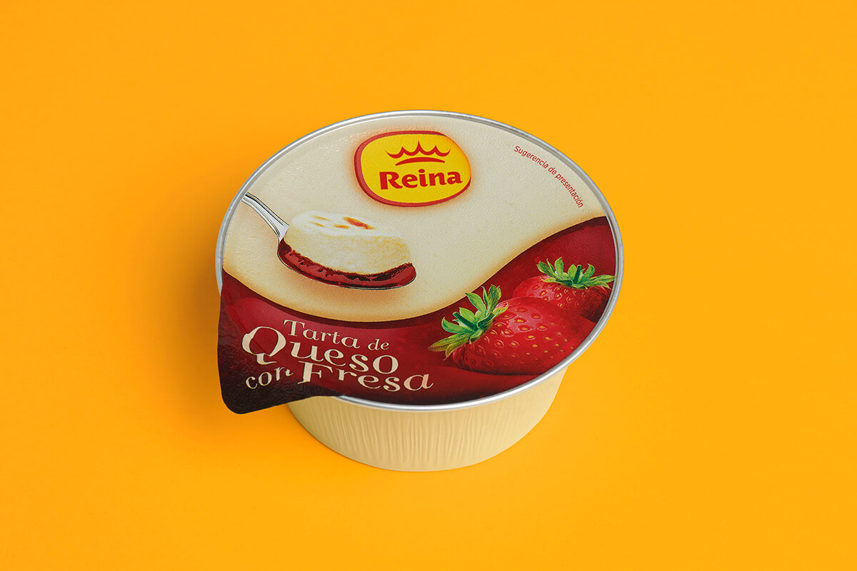
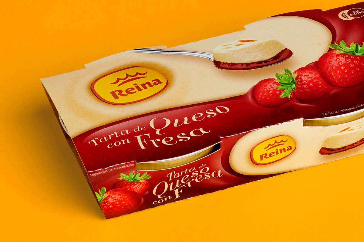
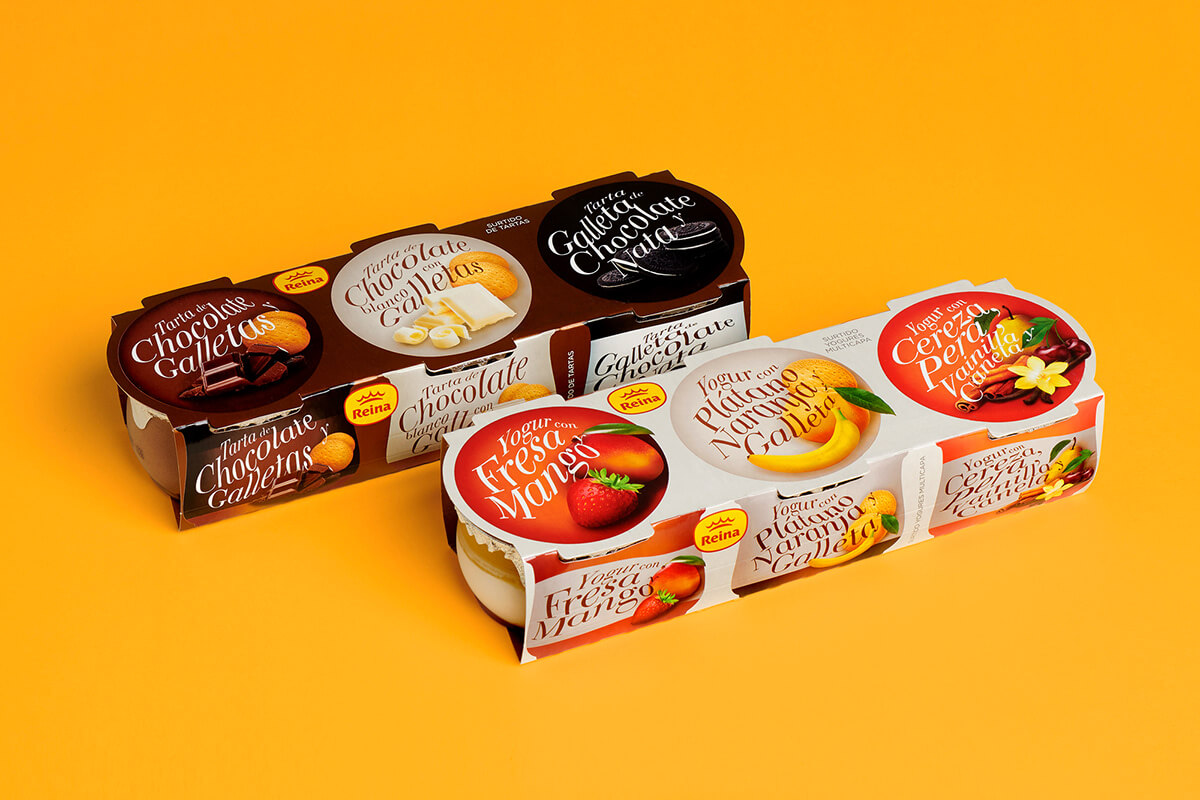
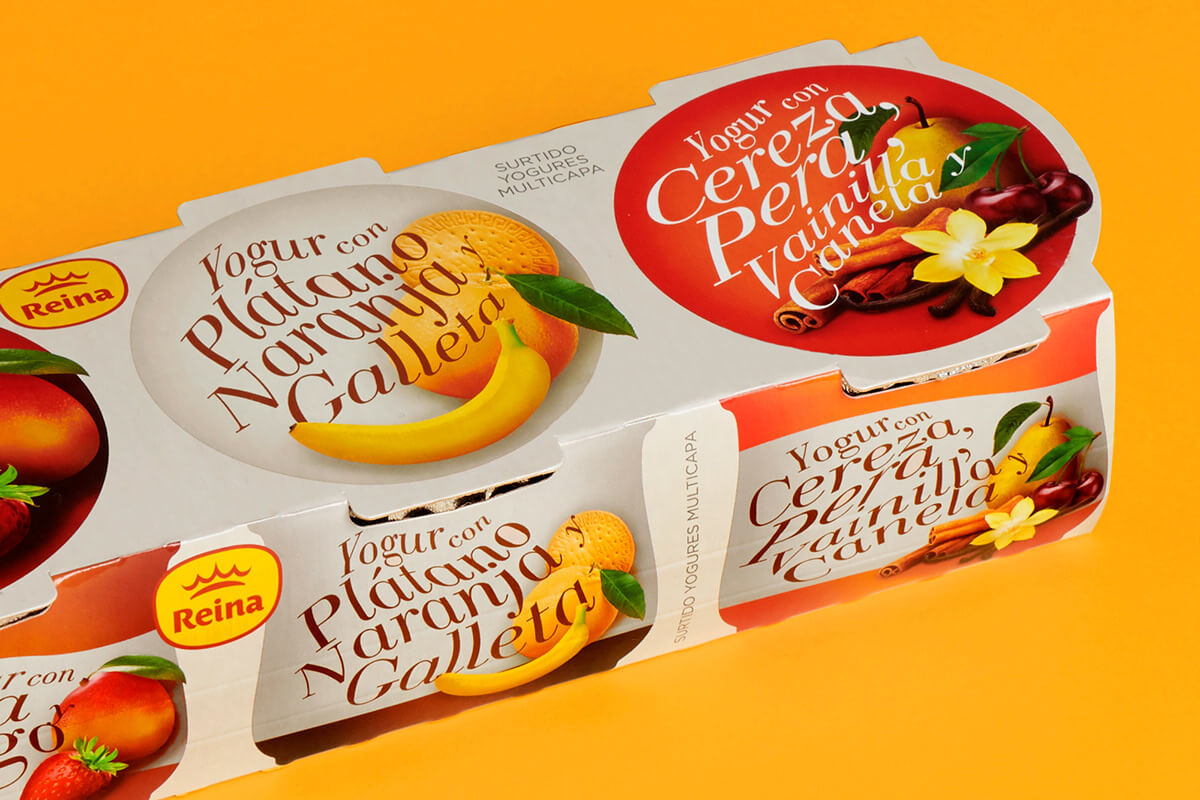
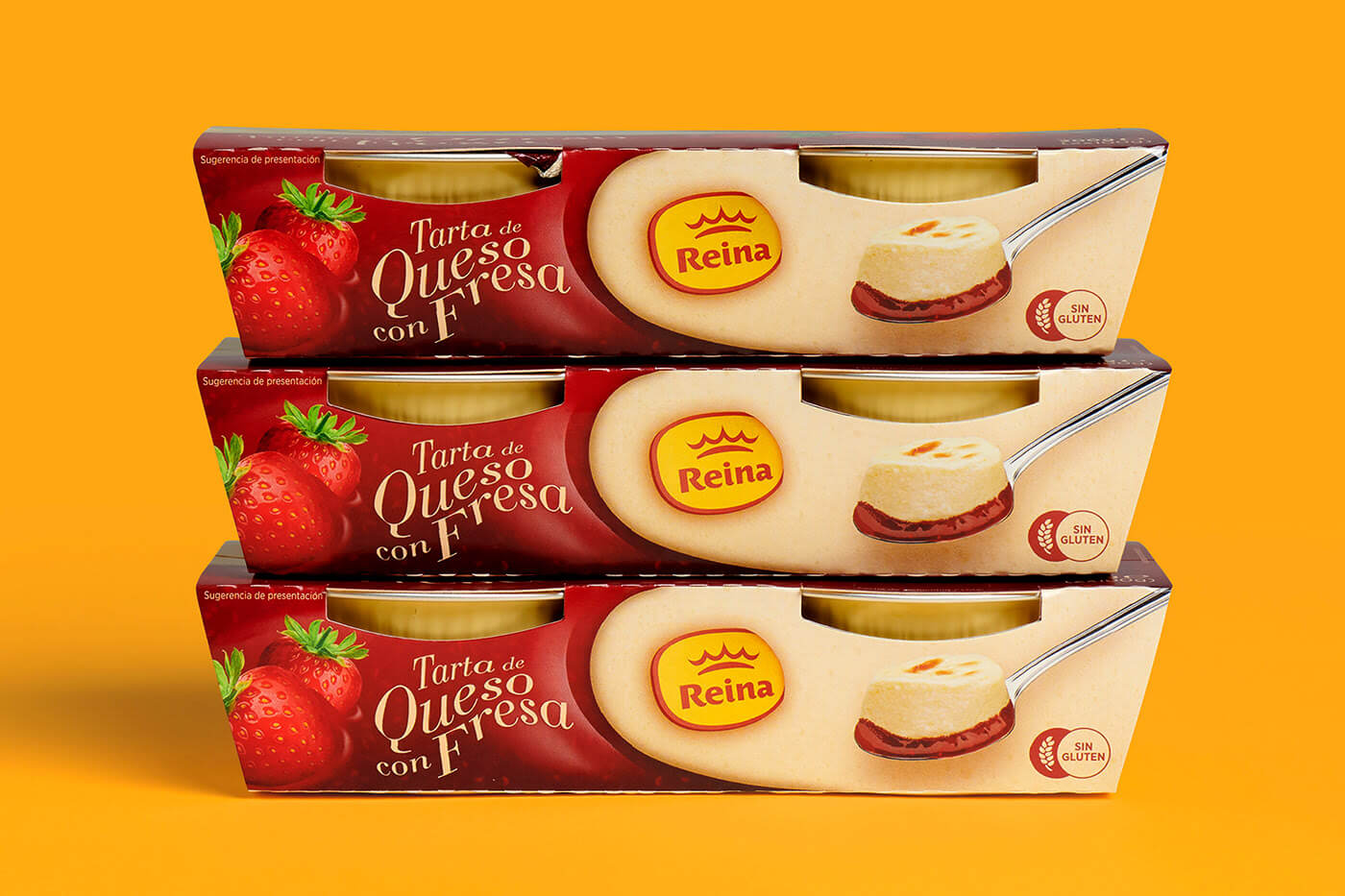
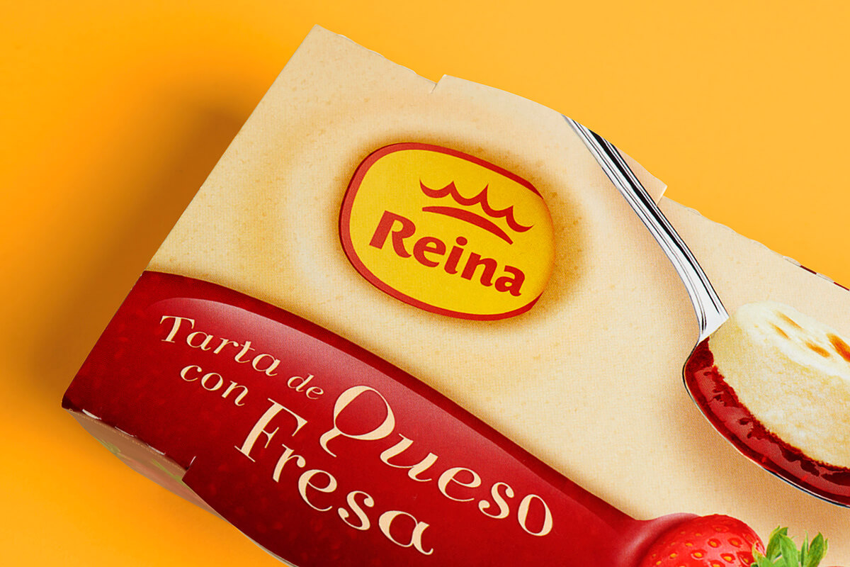
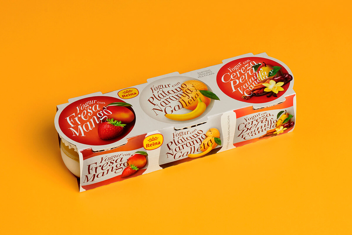
The design of the Reina cake range wants to raise the quality of the packaging to adapt it to the content, an adult dessert, creamy and appetizing for any day.
Project Management
— M A B A
Creative Agency
This line was born after detecting that they had a series of “orphan” desserts distributed among their product catalog. They outlined a new strategy to give them a point of union between all of them: a new line of products that represent the most characteristic desserts from cities around the world.
Once the strategy was proposed, the starting point was to locate the products on the map and detect the most emblematic particularities of each place of origin to represent them graphically and make them recognizable in each packaging.
The result was a very particular design for a line that also opened up a new range of possibilities for the brand, since it served as a launch pad for new desserts and origins to add to its offer.
We’re a team of creatives who are excited about unique ideas and help fin-tech companies to create amazing identity by crafting top-notch UI/UX.
