The name “OPAK” was derived from two sources: Oligopeptide-41, a main active element in the products, and the iconic British Oak, which is a symbol of heavenly wisdom (OP-41).
OPAK
OPAK 6
Website Portfolio
OPAK 4
Creative Design
— Vince Cheung
Creative Director
Project Management
— Chris Chan
Photography
Art Direction
— Kaman Kan
Art direction & creative design
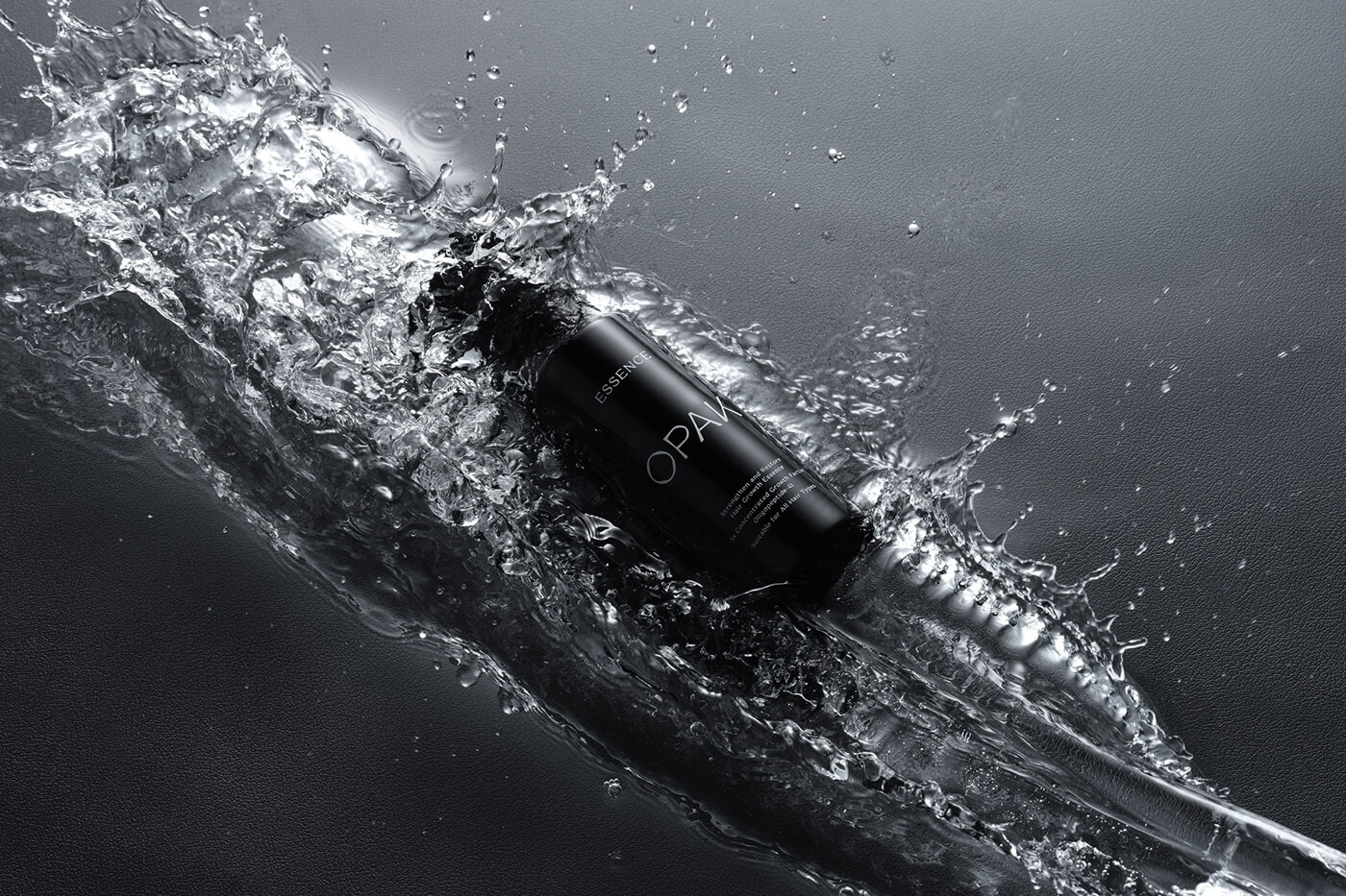
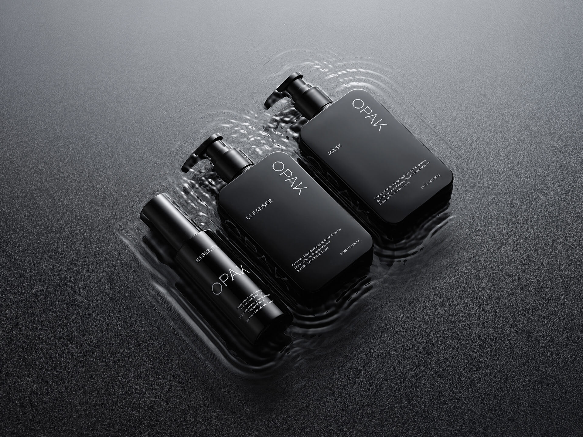
The group not only came up with the name for OPAK, but also designed the logo, brand, positioning, and packaging.
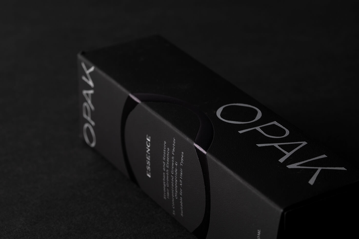
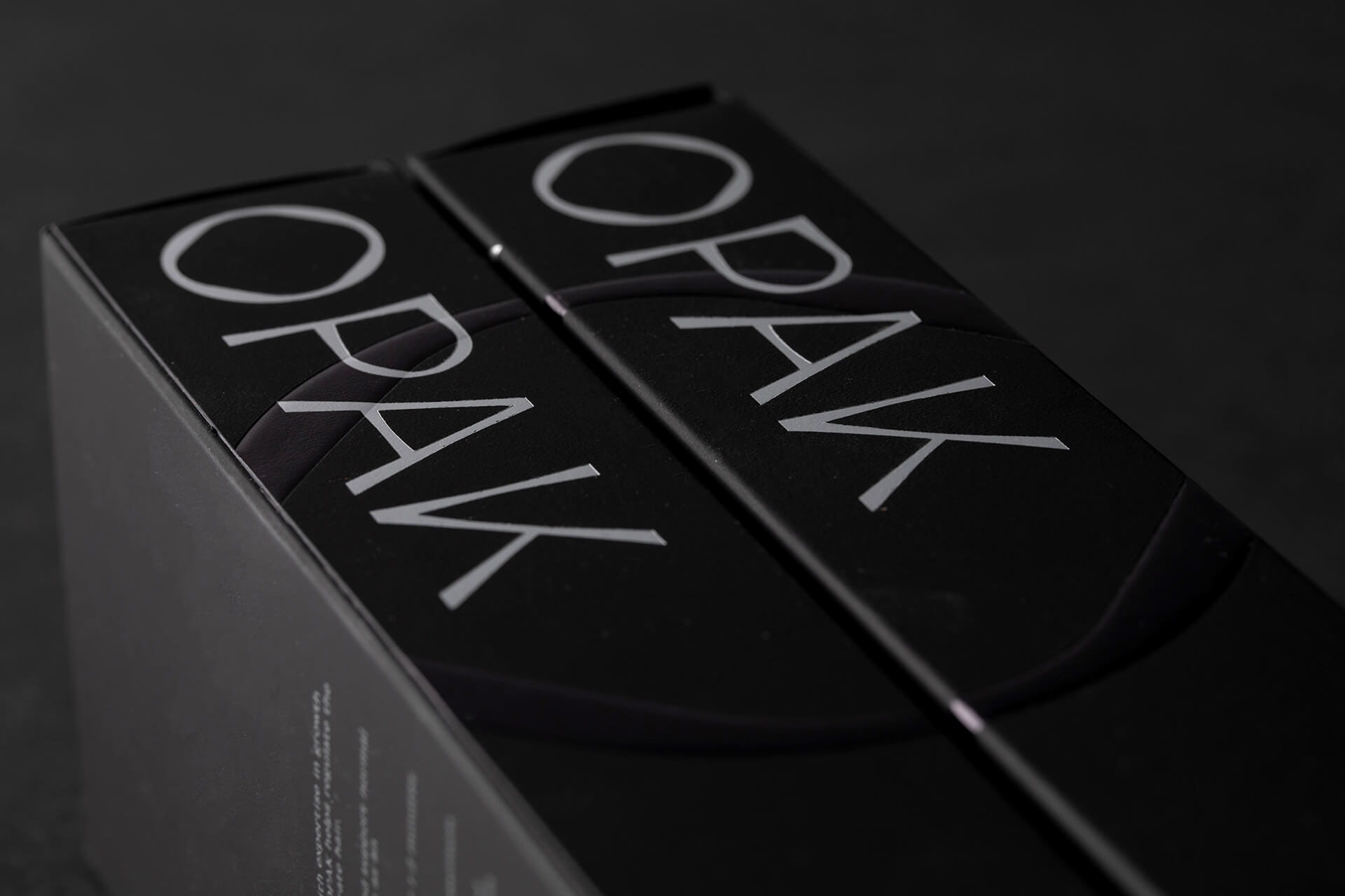
The logo’s typography was carefully considered, with each letter’s curve being given a different stroke weight to give it a classier, more refined look. This little but significant design element also served as a metaphor for OPAK’s meticulous approach to research and development.
The letter O in OPAK, in particular, had several roles. Because of its resemblance to an oak nut, the letter O was singled out to emphasize the idea that the OPAK brand is the result of the hard work of a professional team as a whole. The round shape of O conveyed not only a sense of focus and unity, but also a tense, alluring portal into the future.


We’re a team of creatives who are excited about unique ideas and help fin-tech companies to create amazing identity by crafting top-notch UI/UX.