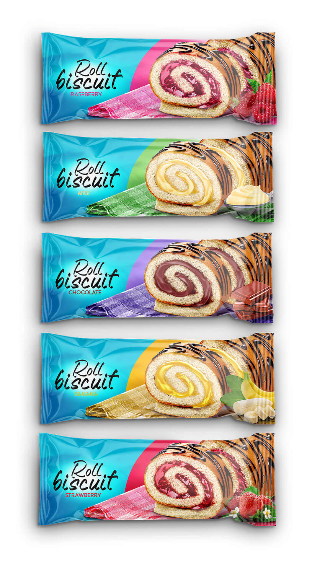
The client’s brief primarily focused on the need to create five new packagings, which would differ from each other in terms of their colors, so that each one of them would effortlessly connect with a specific flavor. The designs should be in line with, and further support, the existing visual identity of Roll Biscuit
-Roll Biscuit Milk
3-strawberry -Roll Biscuit
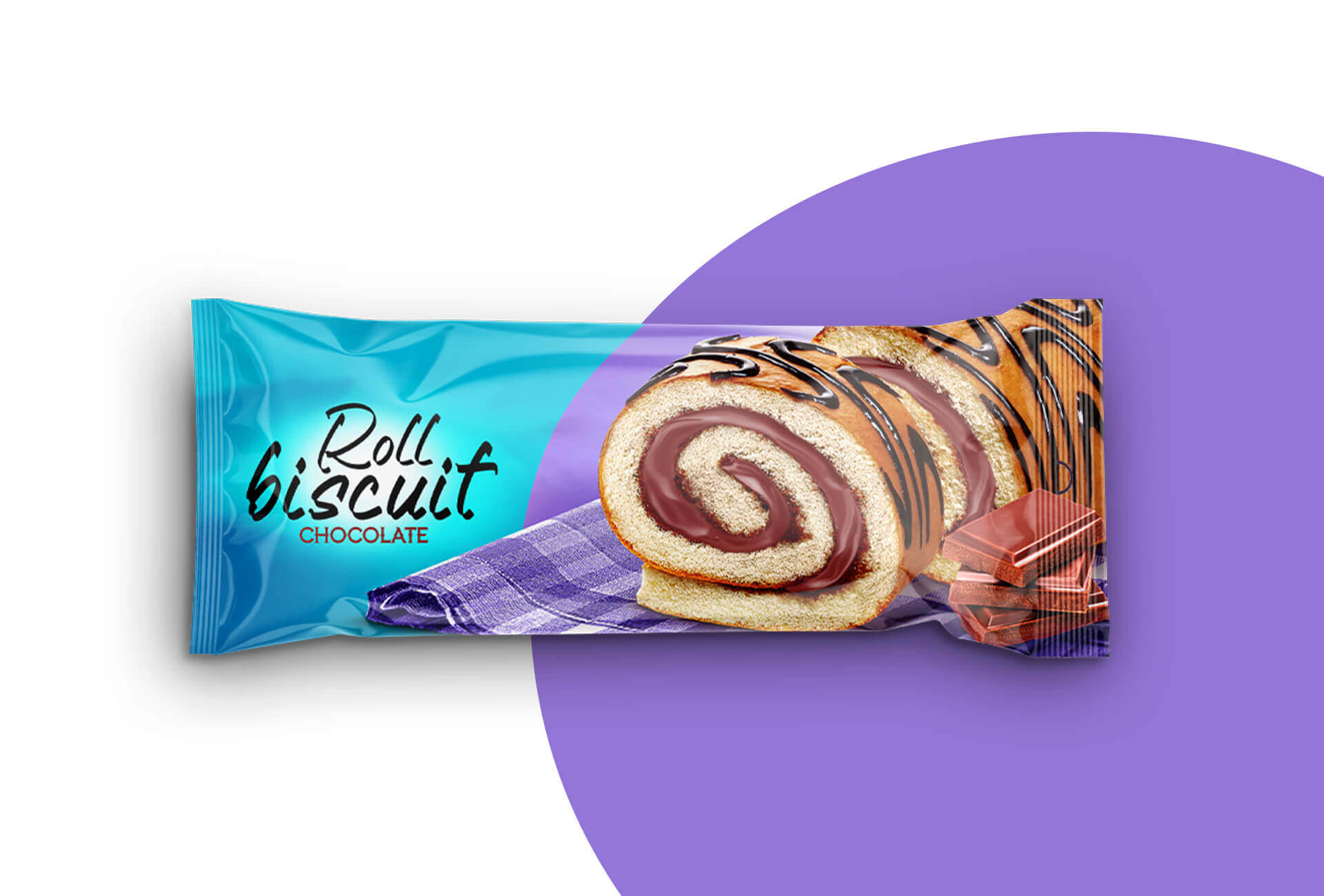
-Roll Biscuit Chocolate
Roll Biscuit Overall
Project Management
— Daler Xusinov
Creative Agency
In this project, the actual product was just applied. Reading and writing names is a breeze.
The packaging is the most important part of selling a product since it displays the product overview and identifies the specific food item within. For the packaging, a manipulation style of design was employed.
The most consistent element of this work is color. To demonstrate the superiority of our wares, we must employ contrasting hues. The sky blue is the main color. A light blue color scheme indicates safety and tranquility. Not only that, but it highlighted the wares against a background of clashing hues!
For the typography, team use two distinct kinds of fonts, each of which has a sweet connotation. Decorative fonts come in second place, after handwriting proper.
Branding Strategy: At introduction, four tastes were developed, and each was assigned a distinct hue. The color of the product within the cup matches the color of the flavor. New varieties in the brand’s menu may be quickly introduced thanks to the logo’s minimalist design, which will see it remain primarily black and white in the future. Bags, posters, and brand advertising are just some of the many other mediums into which the design can be incorporated. A consistent brand identity across all forms of marketing communication was achieved by simply switching the backdrop color.
Memorability: The design is built around a contrasting product, making it simple to recall despite the roll biscuits’ varied hues. Colorful product displays also help draw attention to the sleek style of the business emblem, making it easier to remember.


We’re a team of creatives who are excited about unique ideas and help fin-tech companies to create amazing identity by crafting top-notch UI/UX.