The rebranding of Soom Foods’ packaging was designed with three consumption options in mind: drip, drizzle, or devour.
The Soom sisters realized it was time to relaunch their namesake product, which is the tahini you’ve been missing and the ideal way to enhance your favorite foods.
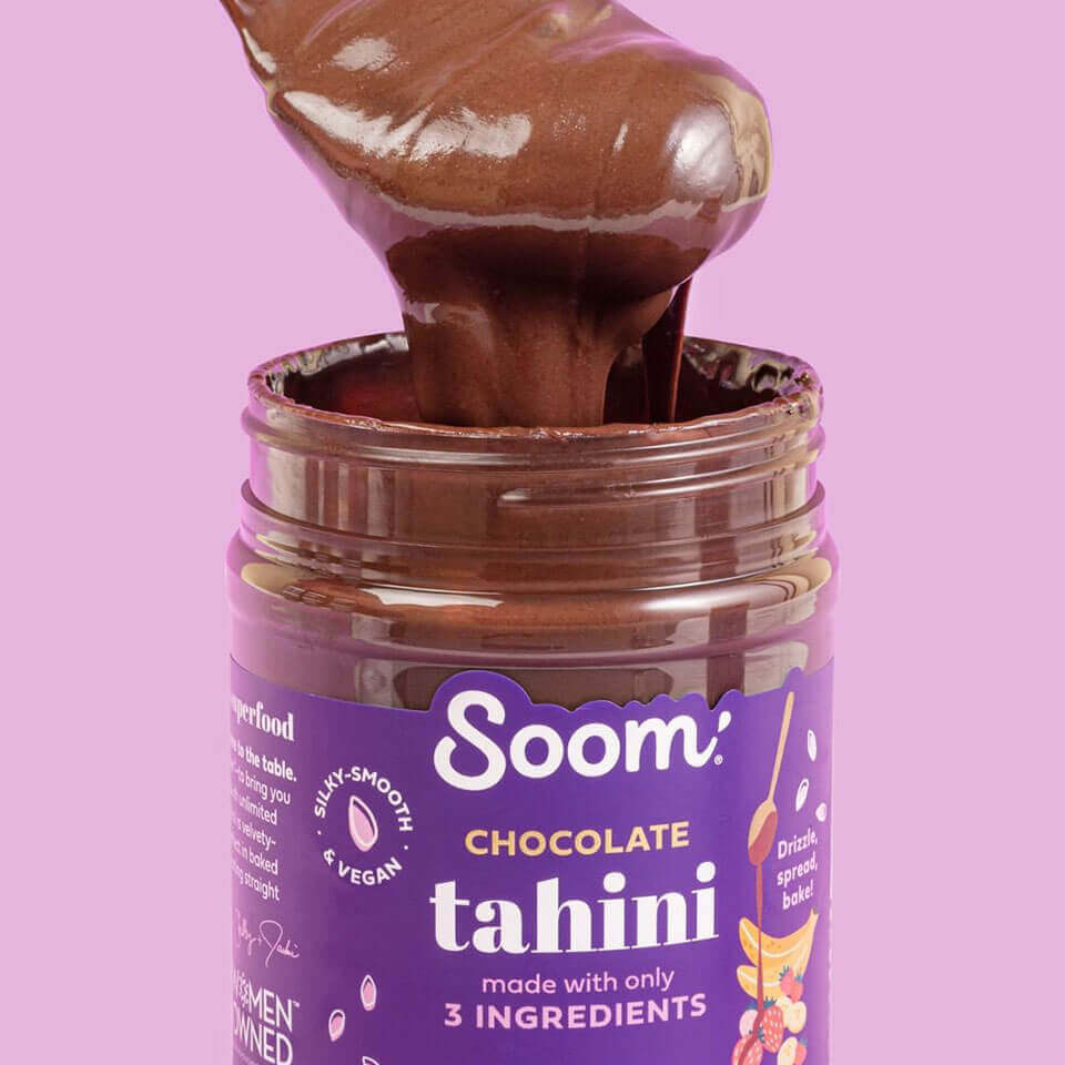
The delectable challenge was to give each variety of roasted and ground sesame tahini a premium appearance while bringing to the fore the delicate but vital educational components included on the box.
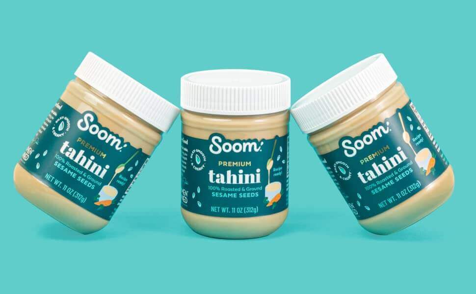
soom 16 oz 3 jar shot
SOOM TAHINIS Shop
Soom-After-2-Tahini-960
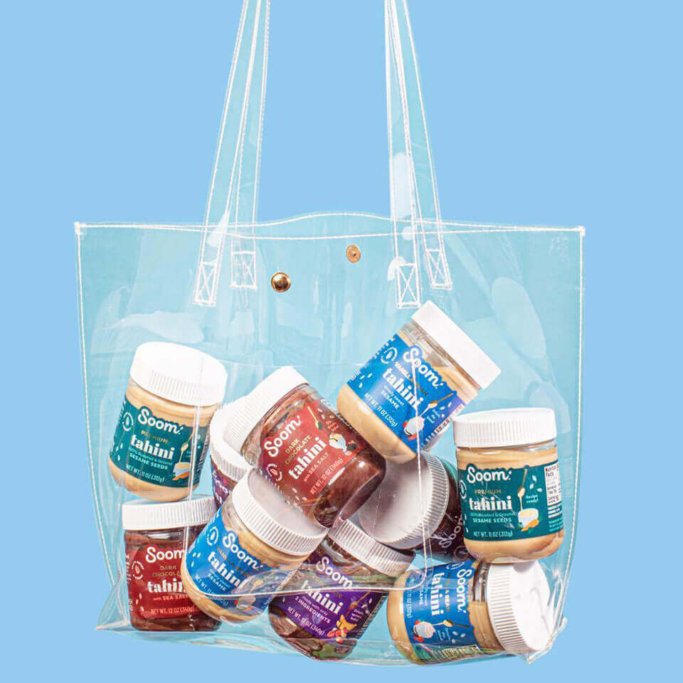
Soom-After-in-bag-960
Project Management
— Maria José Hoyos
Project & Account Team
Art Direction
— Elisa Angel
Portfolio photography Art Director
Creative Design
— Aubrey Ndiweni
Commercial photographer
The Soom Sisters put a lot of time and effort into the rebrand because they aspired to a more sophisticated appearance but had no idea how to achieve it. Commenced with a comprehensive analysis of the ideal hues and visuals for the brand. The end result is a whimsical depiction of the product’s use, capturing the moment the tahini drips down the spoon, with a dash of gold to emphasize the enchantment of the Premium Sesame seeds at the brand’s core.
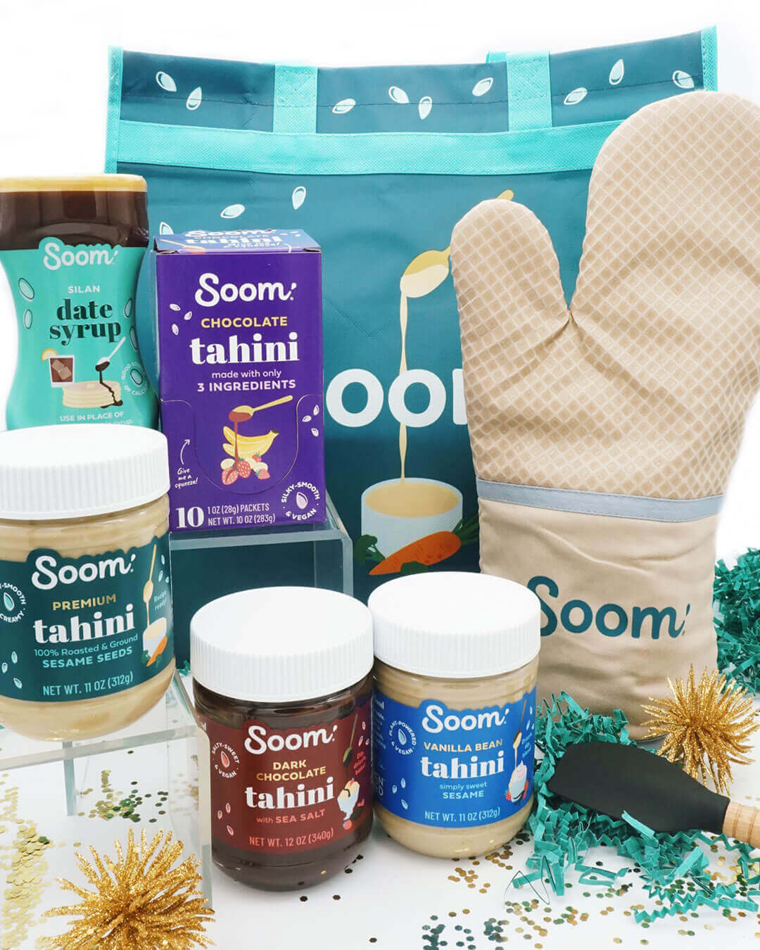
Soom’s Silan Date Syrup was also given a shine to promote and market it as a sweetness alternative and topping in addition to the tahini’s.
The company’s website was the final touch in completing the redesign. We brought the new appearance of Soom to life with lifestyle photographs of daily application, weaving in design elements from the packaging, and paying tribute to the brand’s origins.


We’re a team of creatives who are excited about unique ideas and help fin-tech companies to create amazing identity by crafting top-notch UI/UX.