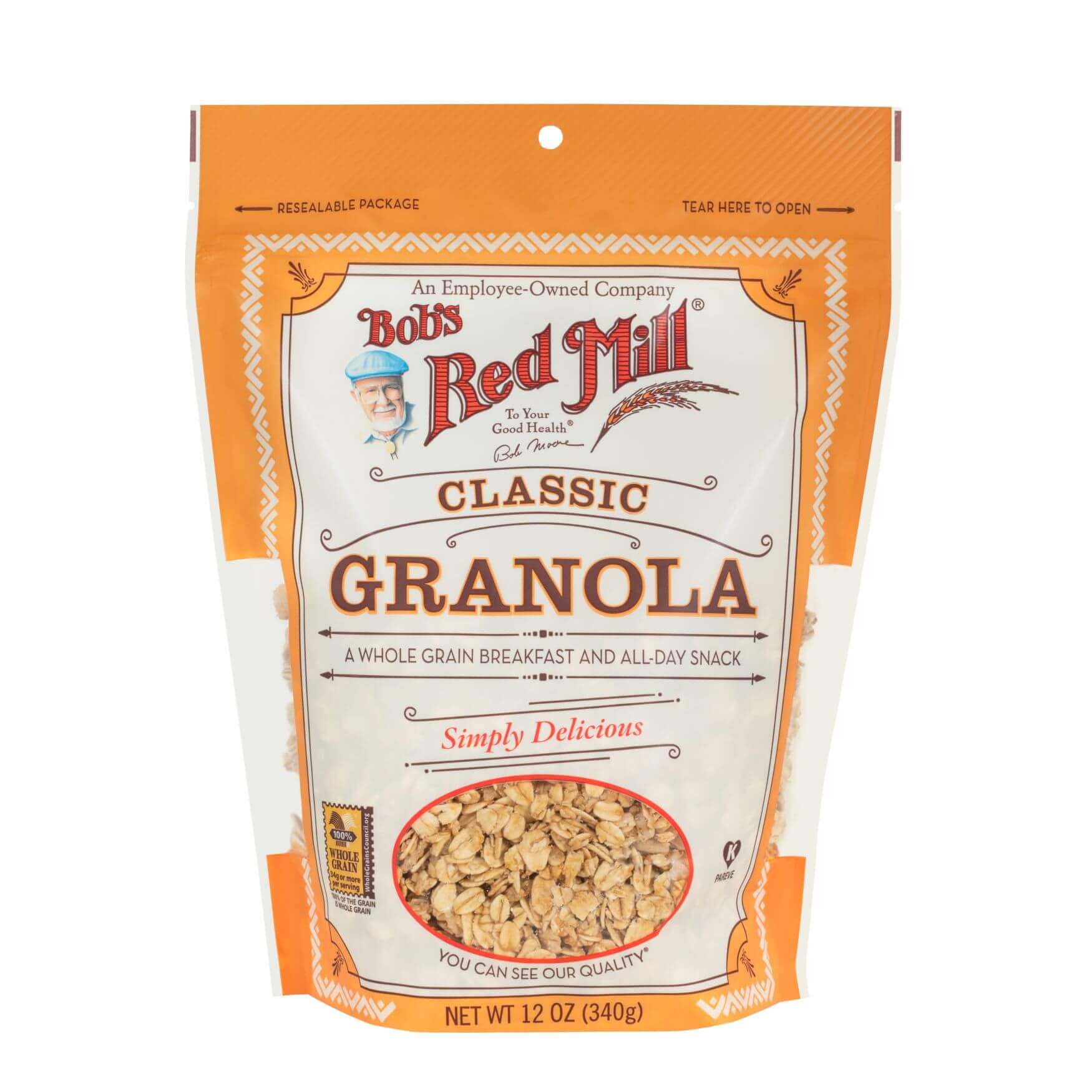
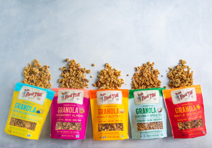
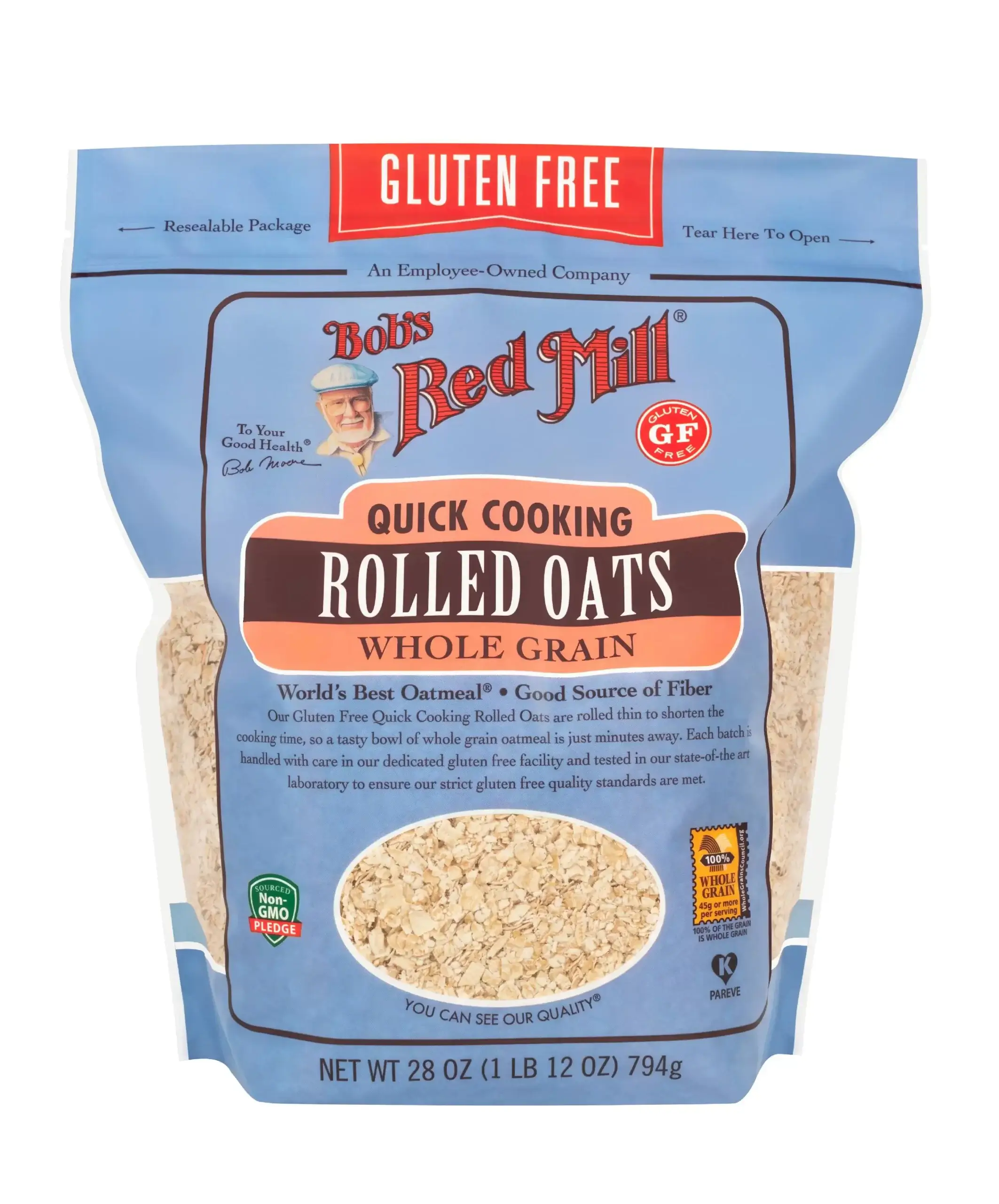
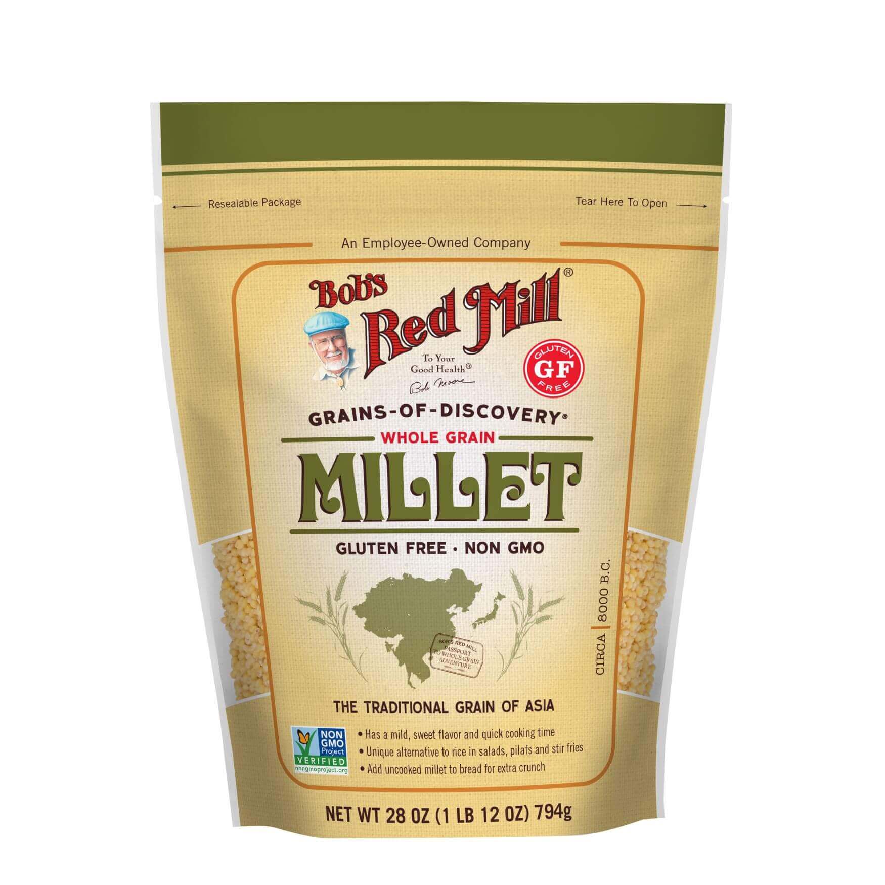
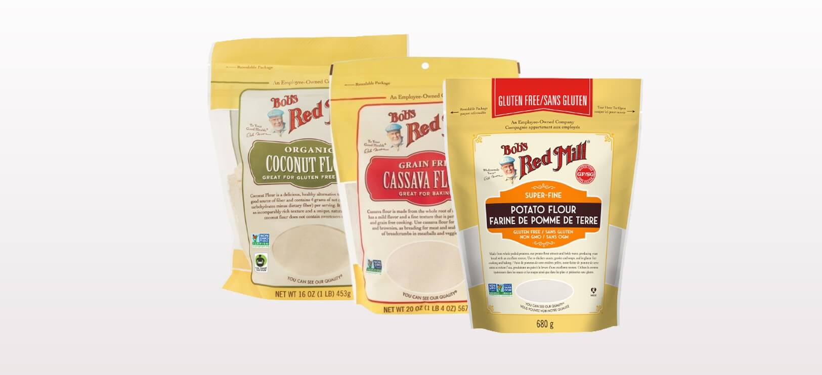
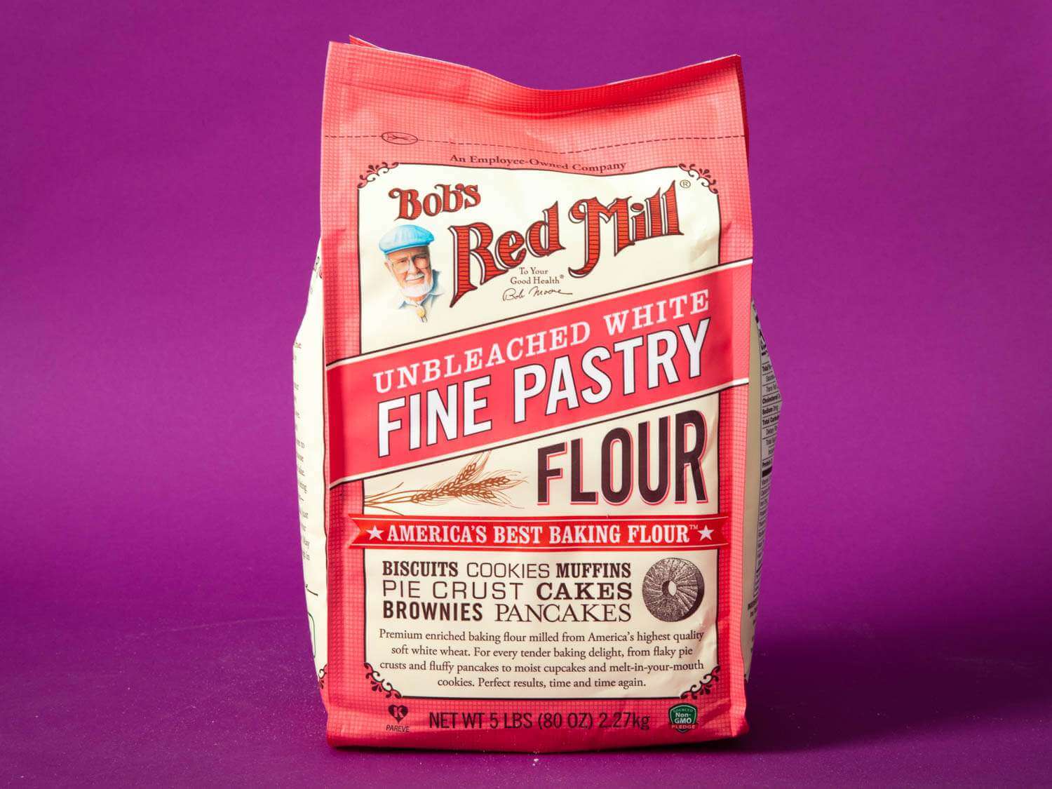
Bob’s Red Mill is a legacy name in the industry that aligns the vision of the creative team to champion healthier, more functional, and more widely applicable product lines. Customer requested that the team spearhead development of Bob’s Red Mill’s grain-free mix products.
When Bob’s Red Mill set out to broaden consumer acceptance of their products, they knew they needed a fresh, modern design that would help them stand out from the crowd without alienating existing customers.
Project Management
— Maria José Hoyos
Project & Account Team
Art Direction
— Elisa Angel
Portfolio photography Art Director
Creative Design
— Aubrey Ndiweni
Commercial photographer
Although the protein powders and grain-free mixes are two very distinct goods aimed at very different demographics, the approaches to solving the problems client presented were very similar. Both needed distinctive selling points to stand out on store shelves and in virtual ones, and to inspire the kind of lasting brand loyalty that has propelled Bob’s Red Mill to new heights over the years.
We’re a team of creatives who are excited about unique ideas and help fin-tech companies to create amazing identity by crafting top-notch UI/UX.
