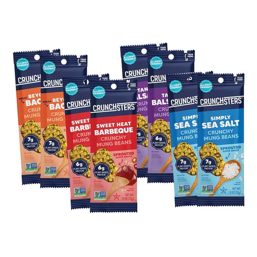
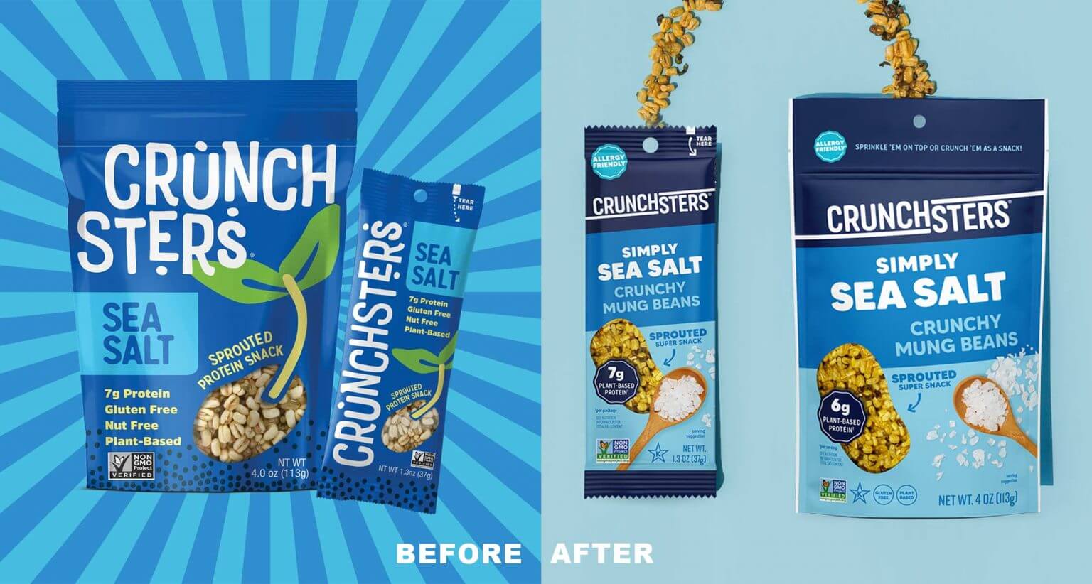
Crunchsters is a healthier snack brand that only uses ingredients that are 100% plant-based and free of the top 8 common allergies. There has been progress on expanding the brand’s presence in both natural and supermarket stores since the product’s introduction in 2015. To stay in that spot, the speeds need to be higher on shelf. Creatively repositioning the brand and snack line while also working with a new product category (mung beans) was posed as a challenge.
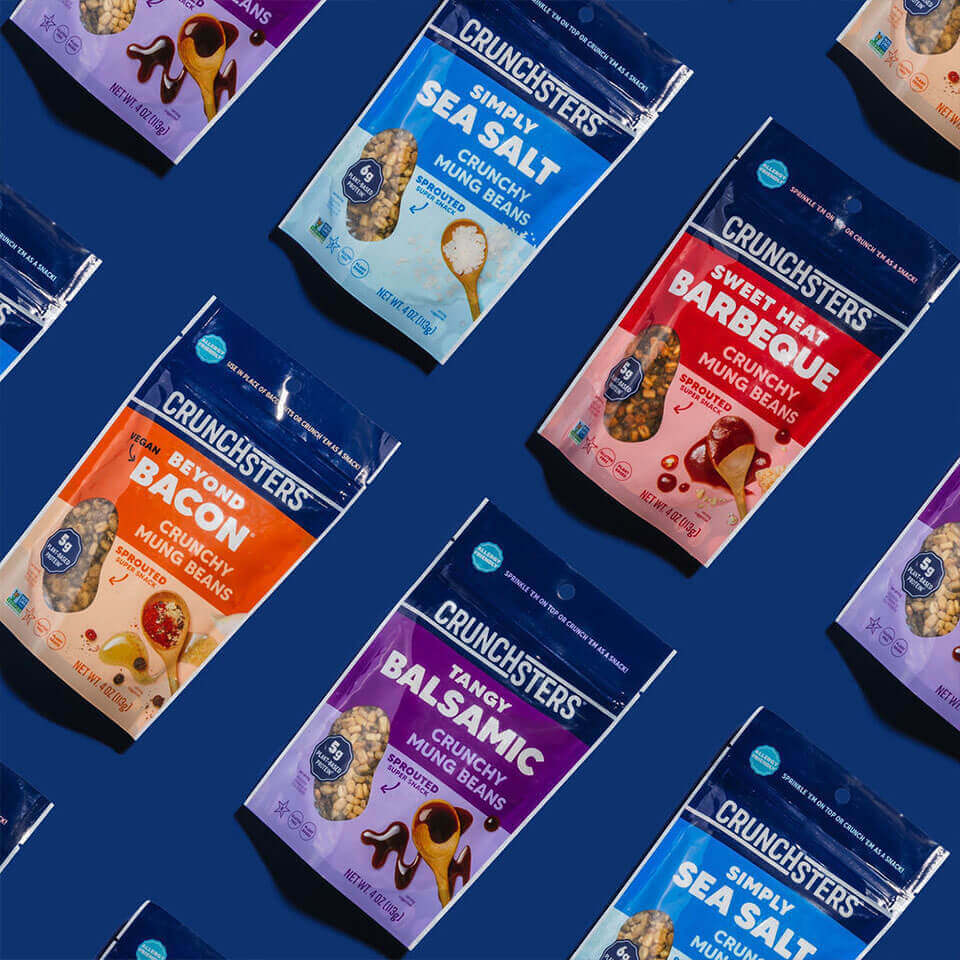
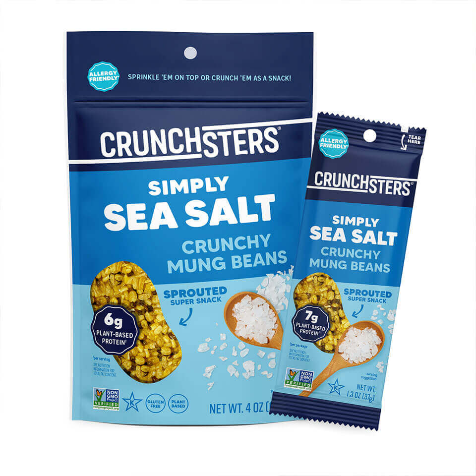
Creating a packaging system that not only has a clear overall brand architecture but also defines each product’s benefits and qualities is crucial to enabling people to comprehend the product quickly and, in turn, willing to take a chance on something new and unusual.
Project Management
— Maria José Hoyos
Project & Account Team
Art Direction
— Elisa Angel
Portfolio photography Art Director
Creative Design
— Aubrey Ndiweni
Commercial photographer
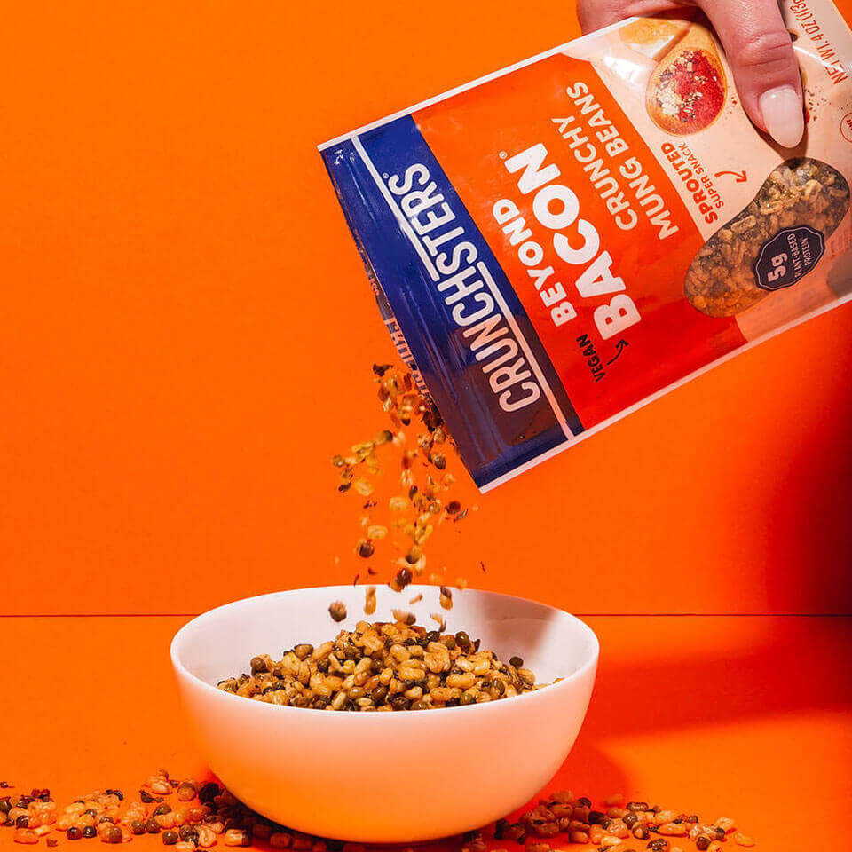
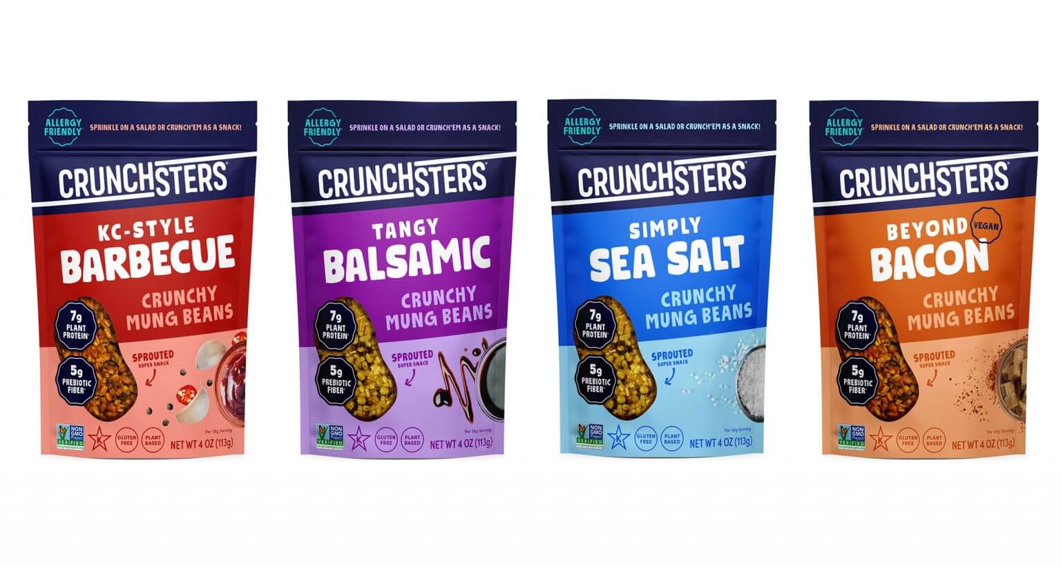
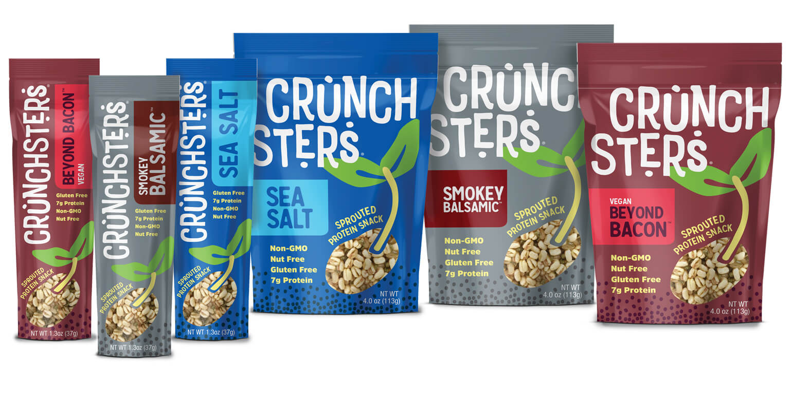
Creative strategy, logo creative, and packaging creative were all mindfully designed for this crunchy and satisfying client. The solution presented for Crunchsters was a delicate balance between educating our consumer on mung beans and ensuring that this high-protein snack was drool-worthy and popped on the shelf. Easier to read branding, strong claims design, bold colors paired with yum-factor ingredient imagery, and well-balanced sections on front-of-pack all lead to a frictionless packaging experience that will give consumer trust at the checkout counter and during product evaluation.
We’re a team of creatives who are excited about unique ideas and help fin-tech companies to create amazing identity by crafting top-notch UI/UX.
