-
Strategy
Brand Strategy, UX Strategy
-
Design
UI/UX Design, Art Direction
-
Client
Envato
Make a scalable web presence for the leader fin-tech company.
Through strategic navigation and page organization, we’ve streamlined user access to their four key areas: The Big Climate Shift, Business Networks, Projects, and Climate Reports. This collaborative effort with Skrew’s marketing team ensures the website effectively meets both user needs and business objectives.
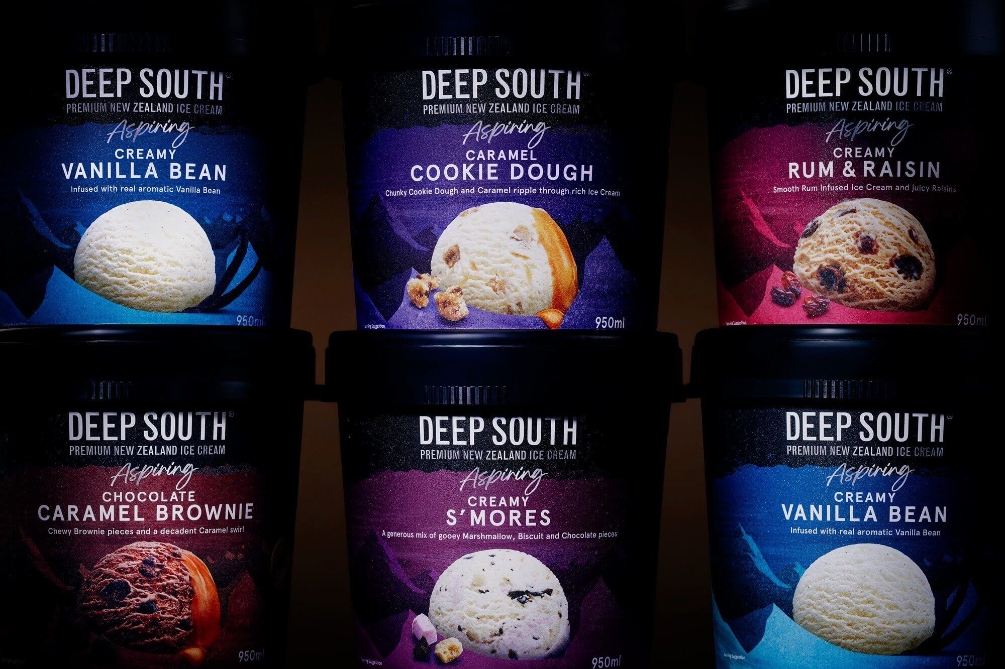
Deep-South-Ice-Cream-2
Deep-South-Ice-Cream-2
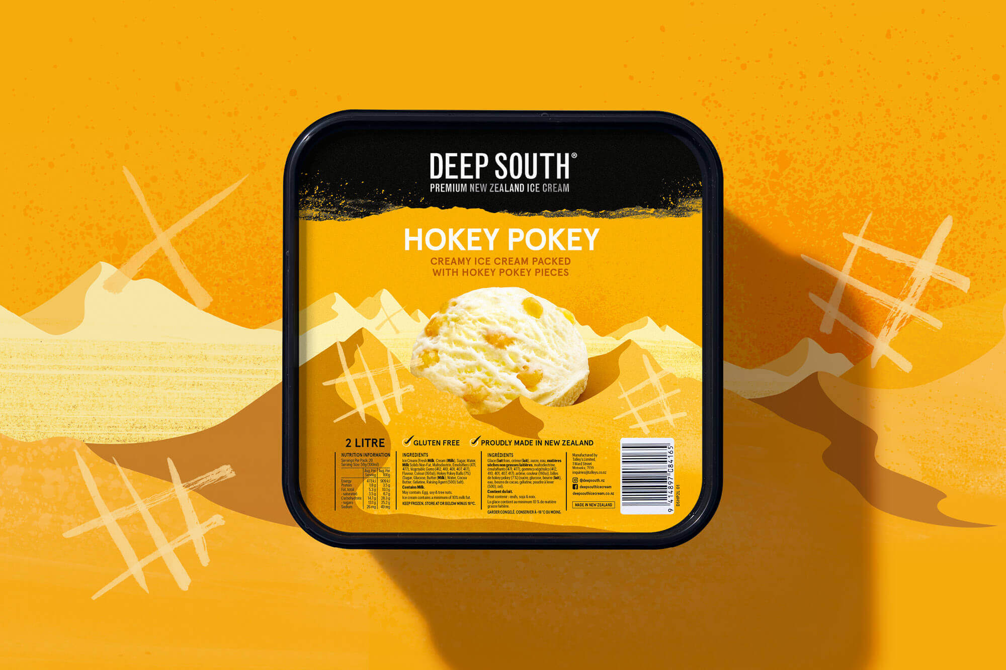
Deep-South-Ice-Cream-10
Deep-South-Ice-Cream-10
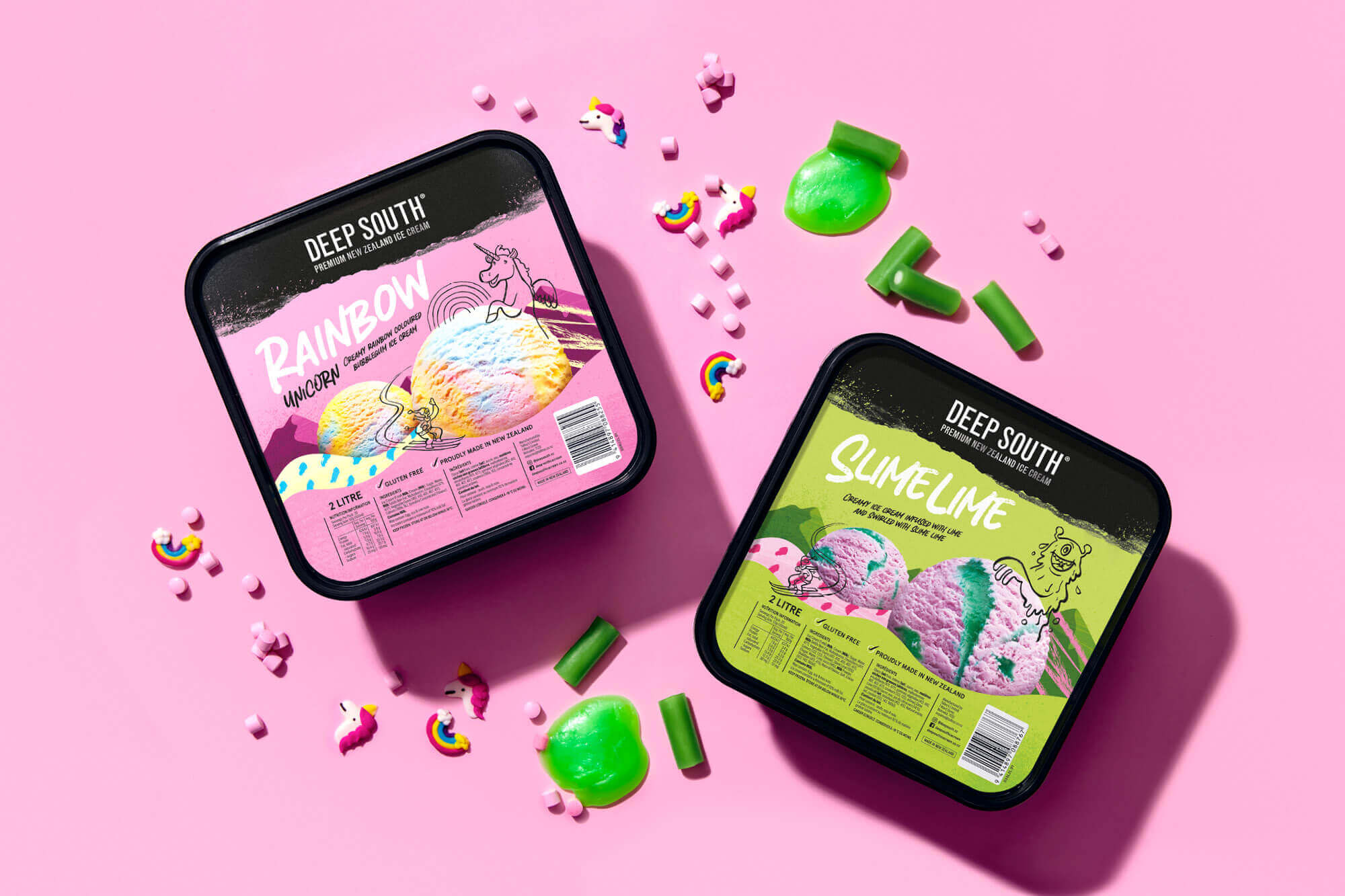
Deep-South-Ice-Cream-11
Deep-South-Ice-Cream-11
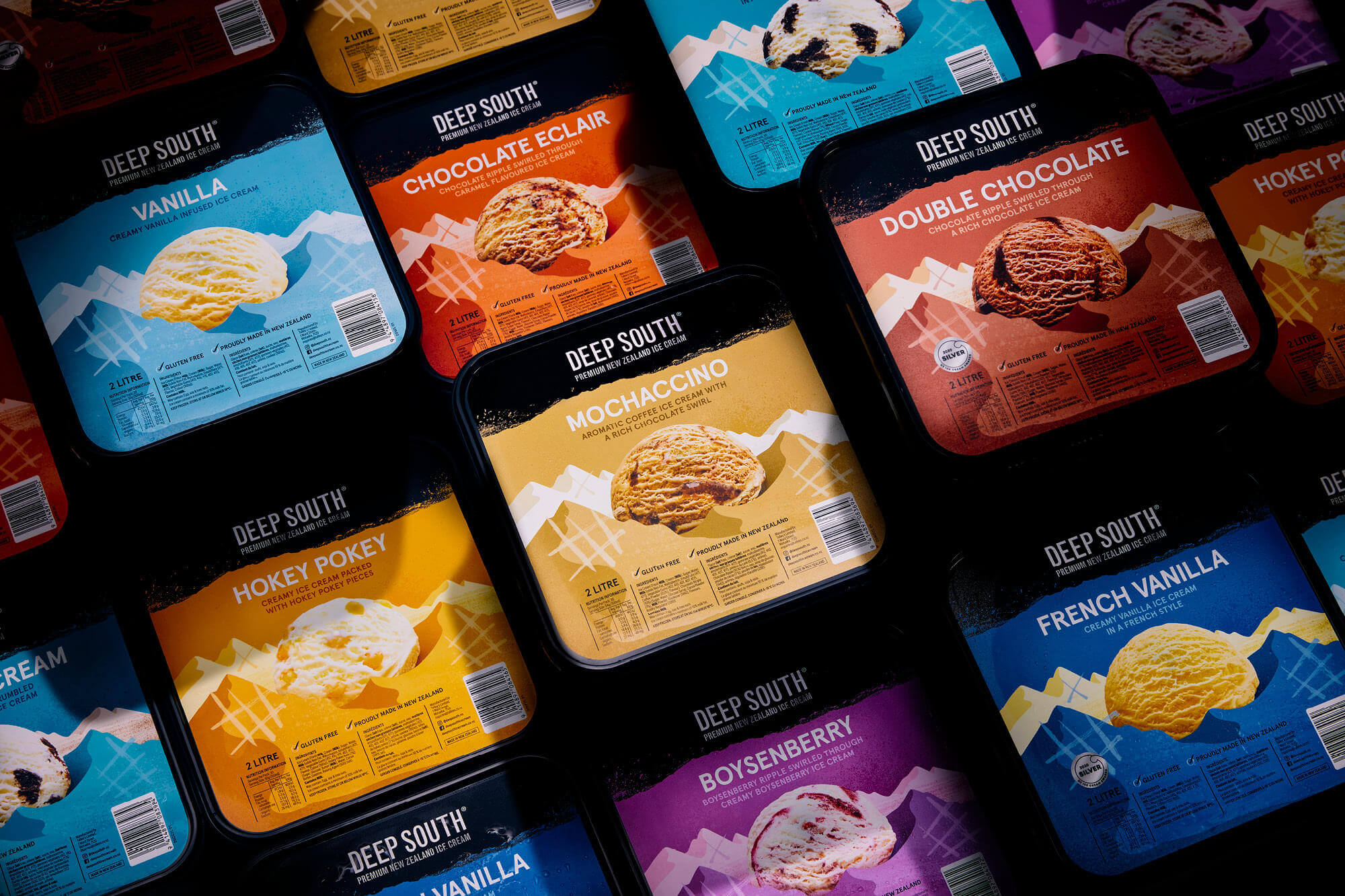
Deep-South-Ice-Cream-9
Deep-South-Ice-Cream-9
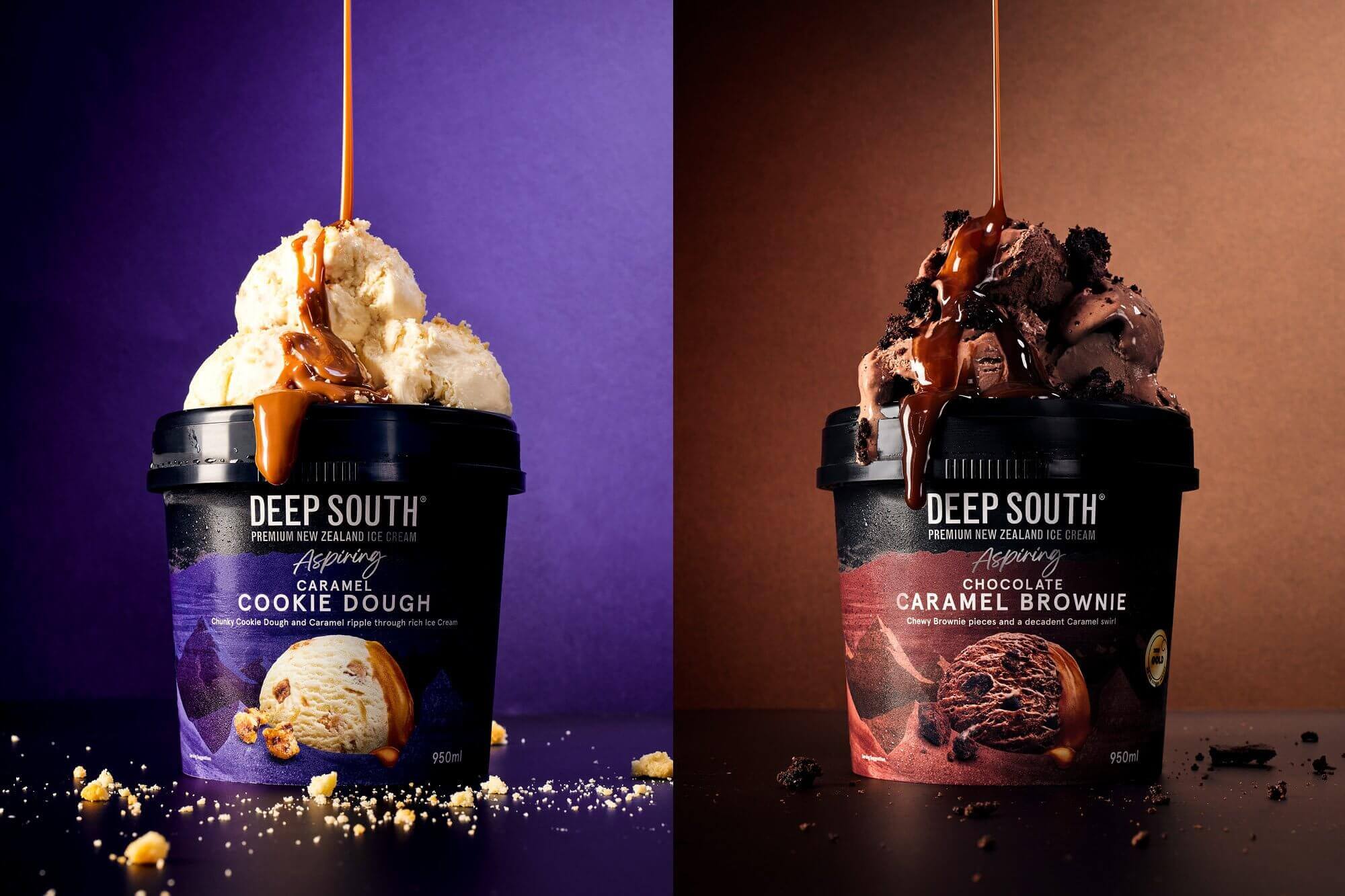
Deep-South-Ice-Cream-6
Deep-South-Ice-Cream-6
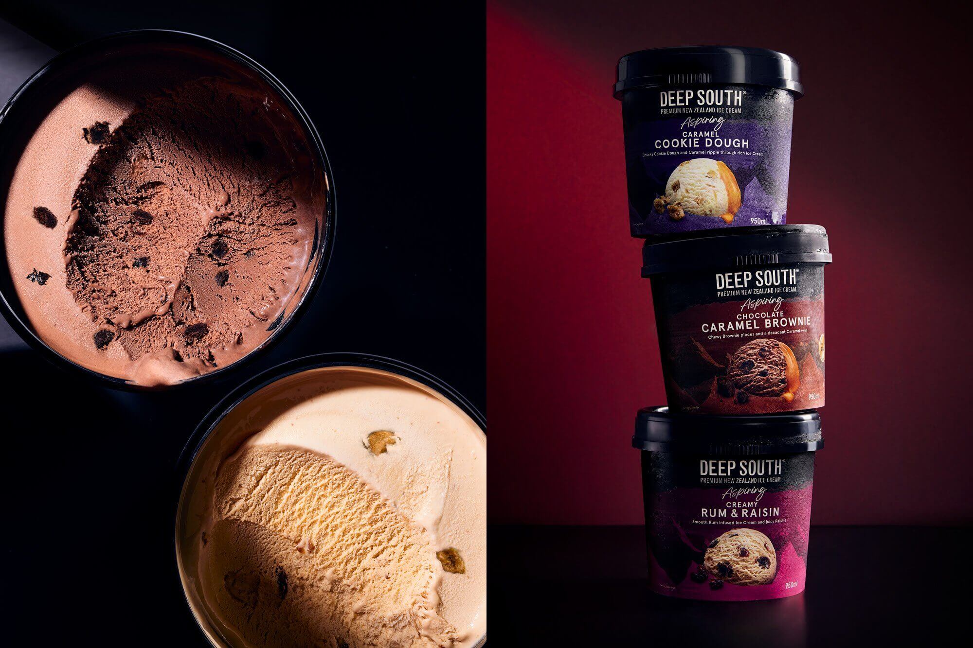
Deep-South-Ice-Cream-5
Deep-South-Ice-Cream-5
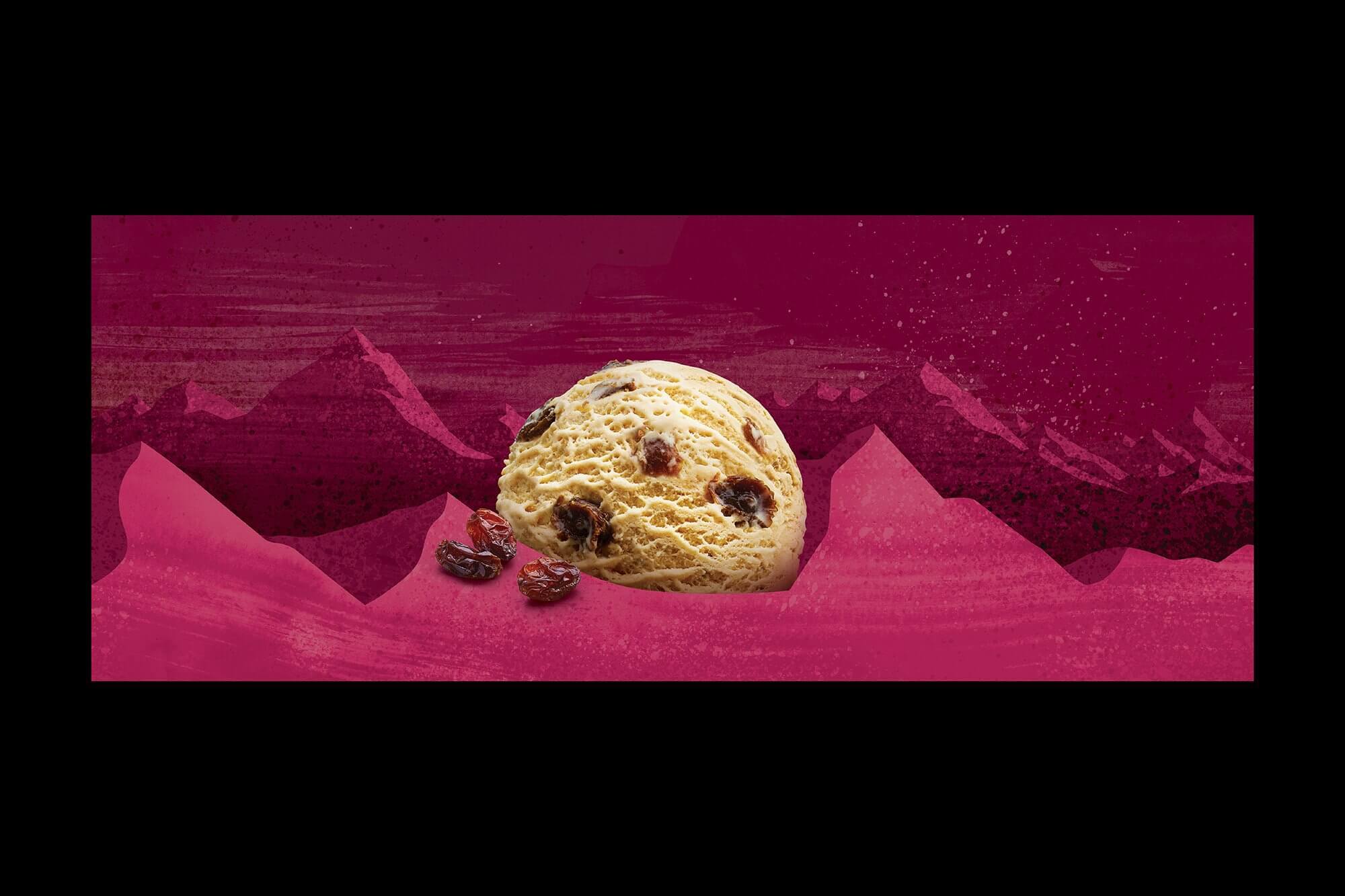
Deep-South-Ice-Cream-4
Deep-South-Ice-Cream-4
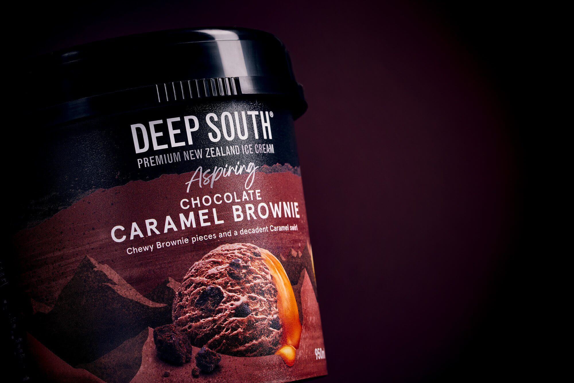
Deep-South-Ice-Cream-3
Deep-South-Ice-Cream-3
Say Hi to people
behind the magic.
Project Management
— John Stamper
Project & Account Manager
— Stacey Grey
Project & Account Manager
Art Direction
— Stephen Miller
Art direction & creative design
— Mark Rickson
Project & Account Manager
Creative Design
— Alex Morton
Creative designer
Send us an email,
to discuss a new project.
We’re a team of creatives who are excited about unique ideas and help fin-tech companies to create amazing identity by crafting top-notch UI/UX.

